I’m excited to be part of a new research group - the Conservation Aquaculture Research Team at NCEAS. Our group is interested in helping shape the future of sustainable aquaculture. Over the past couple of decades, farmed seafood has grown significantly and is likely to become the dominant source of where we get our fish as global populations increase. I wanted to take a look at this trend over time using data from the Food and Agriculture Organization (FAO). This also gave me the opportunity to play with some of the packages out there that create dynamic visualizations. I’ve used the plotly and googlevis R packages to create interactive plots, and the animation package to create gifs from raster data (e.g. Sea Surface Temperature over time), but I’ve never created a high-quality dynamic visualization. I know D3.js is often used to create beautiful figures, but I don’t have the time to learn D3.js (yet) and I figured there had to be a way to do something fancy in R. And of course, I was right. So this is my process of creating a dynamic visualization with the tweenr package. ___
Installation
Install and/or load packages:
I use ggplot2, gganimate, ggthemes anad tweenr for customizing the figures.
library(ggplot2)
#devtools::install_github("dgrtwo/gganimate")
library(gganimate)
library(tweenr)
library(ggthemes)
library(tidyverse)
Data wrangling
I start with data downloaded from FAO’s website, specifically the “Total Production” dataset CSV. One problem with using this dataset to understand how seafood production from wild capture (i.e. wild-caught from the ocean) and aquaculture (farmed, not wild) has grown over time, is that this data does not differentiate between fish caught for consumption versus non-consumption (e.g. fish used for feed).
#this data identifies aquaculture vs wild capture production
source <- read_csv("https://raw.githubusercontent.com/CART-sci/storymap/master/data/GlobalProuction_2017.1.1/CL_FI_PRODUCTION_SOURCE.csv")

#this is the time series data for global production (does not discern b/w seafood and nonseafood)
fao <- read_csv("https://raw.githubusercontent.com/CART-sci/storymap/master/data/GlobalProuction_2017.1.1/TS_FI_PRODUCTION.csv")

##species info
spp <- read_csv("https://raw.githubusercontent.com/CART-sci/storymap/master/data/GlobalProuction_2017.1.1/CL_FI_SPECIES_GROUPS.csv") %>%
  mutate(Species = `3Alpha_Code`)
By using a second dataset on global food supply of seafood, I can calculate the amount of fish caught for consumption. Why not only use this dataset? Because this one does not differentiate between wild capture and aquaculture.
If you’re interested in the data I used, here is a screenshot of the manual query on FAOSTAT.
I am still hopeful that someone, somewhere will create an FAO R package that lets me query all of their data directly from R. In the meantime, I’ll wrangle these two datasets together as best I can.
#read in the seafood data queried from FAOSTAT and get totals per year
seafood <- read_csv("https://raw.githubusercontent.com/CART-sci/storymap/master/data/FAOSTAT_data_12-21-2017.csv") %>%
  group_by(Year) %>%
  summarize(sf_tons = sum(Value))
Calculate annual capture and aquaculture production
Since no dataset from FAO has exactly what I want, I can take the seafood dataset, calculate total production (tons) per year, and then remove the total aquaculture production for each year calculated from the fao dataset. Then I have wild capture seafood per year (from the seafood dataset), and aquaculture production per year (from the fao dataset).
data <- fao %>%
  left_join(spp) %>%
  mutate(source =
           case_when(
             Source %in% c(1,2,3,5) ~ "Aquaculture",
             Source == 4 ~ "Wild_Capture"
           )) %>%
  filter(Major_Group != "PLANTAE AQUATICAE") %>% #removing aquatic plants
  mutate(source = as.factor(source)) %>%         #doing this for tweenr...still don't know why we need to
  group_by(source, Year) %>%
  summarize(tons = sum(Quantity, na.rm = T)/1000000) %>%
  filter(Year > 1989) %>%                        #only interested in showing 1990 onwards
  spread(source, tons) %>%
  left_join(seafood, by = "Year") %>%
  mutate(Wild_for_food = (sf_tons/1000000) - Aquaculture) %>% #subtract aquaculture from seafood series to get wild capture for seafood
  filter(!is.na(Wild_for_food)) %>%
  select(Year, Aquaculture, Wild_for_food)
Forecast production values
The data only goes to 2013, but I want to include forecasted growth of these two sectors. The 2016 State of the Worlds Fisheries and Aquaculture report projects a 39% growth in Aquaculture production and just a 1% growth in Wild Capture. To make this easy, I simply used the 2013 production values and set the 2025 values to 139% and 101% of those values.
I create two new dataframes, one for all years 2014-2024 with two years full of NA, one for Aquaculture and one for Wild_for_food (Wild Capture). The second is a one row dataframe for the year 2025 with the Aquaculture and Wild_fod_food values equal to 139% and 101% of their 2013 values respectively. Using the zoo::na.approx() function I simply do a linear interpolation of production values between 2013 and 2025.
#forecast forward to 2025
#Projected 1% of growth in wild capture by 2025
#projected 39% for aquaculture

yrs <- data.frame(Year = 2014:2024,
                  Aquaculture = NA,
                  Wild_for_food = NA)

data_2025 <- data.frame(Year = 2025,
                        Aquaculture = 1.39*last(data$Aquaculture),
                        Wild_for_food = 1.01*last(data$Wild_for_food))

plot_data <- data %>%
  rbind(yrs, data_2025) %>%
  mutate(Aquaculture = zoo::na.approx(.$Aquaculture),
         Wild_for_food = zoo::na.approx(.$Wild_for_food)) %>%
  gather(source, tons, Aquaculture, Wild_for_food)%>%
  mutate(ease = "linear",
         x = Year) %>%
  rename(y = tons,
         id = source,
         time = Year)
Notice I renamed the columns to x, y, id, and time. This is for use in the next section with tweenr. The x column identifies what I want on the x-axis (years), y identifies the y-axis (tons), id identifies the different series for plotting (Aquaculture or Wild_for_food) and time is used to tell tween_elements() what the different time points will be for interpolation. The ease column will tell tween_elements() what the easing (or interpolation) function will be. In this case, I just want a linear interpolation between my datapoints.
Making the plot
Here’s how I went from creating a static ggplot to animating with gganimate then improving it with tweenr
Static ggplot
static_plot <- ggplot(plot_data, aes(x = time, y = y)) +
  geom_line(aes(color = id), show.legend = F) +
  labs(x = "Year",
       y = "Seafood Production (million tonnes)") +
  theme_minimal()

static_plot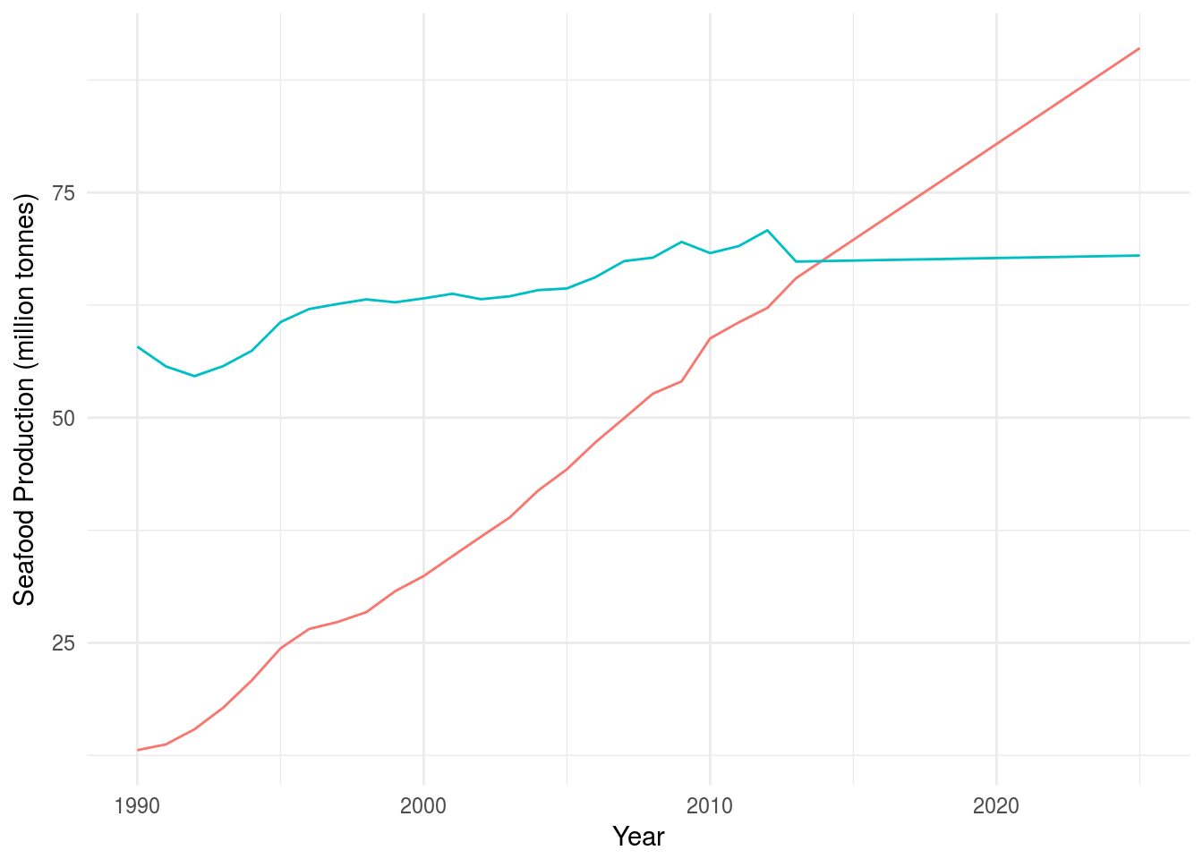
Animate with gganimate()
You can animate a static ggplot just with the gganimate() package.
dynam_plot <- ggplot(plot_data, aes(x = x, y = y, cumulative = TRUE, frame = time)) +
  geom_line(aes(color = id), show.legend = F) +
  labs(x = "Year",
       y = "Seafood Production (million tonnes)") +
  theme_hc() +
  scale_y_continuous(breaks = seq(0, 100, by = 25)) +
  scale_color_manual(values = c("#24757A", "#7FBAC0")) +
  ylim(0, 100) +
  theme_hc()

gganimate(dynam_plot, filename = "fao_gganimate.gif", title_frame = F)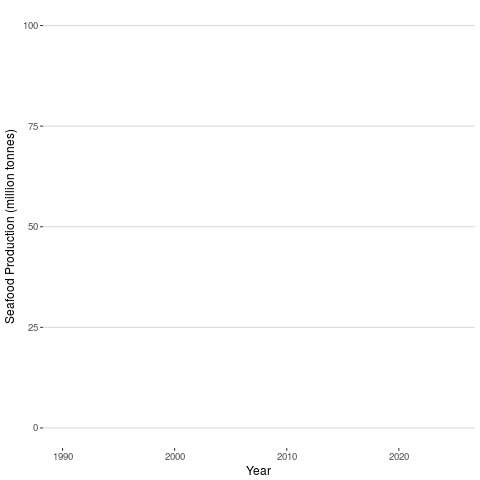
Smooth animation with tweenr + ggplot + gganimate
To make the animation smoother, I’m using the tweenr package. Specifically, the tween_elements() function creates a new dataframe with interpolated points between your datapoints (called “tweens” !) allowing gganimate to plot all these points one after the other, resulting in a smooth dynamic visualization. The nframes argument allows you to set how many total timepoints you want. I played around with this and chose 100 because I thought it gave the right speed. The more nframes, the more points to plot and thus the slower the visualization. I suggest just playing with this argument until the animation looks right to you.
After creating the new dataframe with tween_elements() you use ggplot and gganimate to create the final animation.
data_tween <- plot_data %>%
  tween_elements(., "time", "id", "ease", nframes = 100) %>%   #using tweenr!
  mutate(year = round(time), id = .group) %>%
  left_join(plot_data)

tween_plot <- ggplot(data_tween, aes(x = x, y = y, frame = .frame, color = id)) +
  geom_path(aes(group = id, cumulative = T), size = 1, show.legend = F) +
  xlab("") +
  ylab("Seafood Production (million tonnes)") +
  scale_y_continuous(breaks = seq(0, 100, by = 25)) +
  scale_color_manual(values = c("#24757A", "#7FBAC0")) +
  ylim(0, 100) +
  theme_hc() +
  theme(axis.title.y = element_text(size=14),
        axis.text.y = element_text( size=12),
        axis.text.x = element_text(size = 12)) +
  annotate(geom = "text", x = 1994, y = 29, label = "Aquaculture",
           cex = 6, angle = 22, fontface = "bold", color = "#24757A") +
  annotate(geom = "text", x = 1994, y = 70, label = "Wild Capture",
           cex = 6, fontface = "bold", color = "#7FBAC0") +
  geom_segment(aes(x=2015,xend=2020, y=88, yend=88),arrow=arrow(length=unit(0.2,"cm")),show.legend=F, color = "darkgray") +
  annotate(geom = "text", x = 2013, y = 88, label = "Estimated \nfuture growth", color= "darkgray", fontface = "bold", cex = 4.5, angle = 90) +
  geom_vline(xintercept=c(2015), linetype="dotted"); tween_plot

gganimate(tween_plot, title_frame = FALSE, interval = 0.05)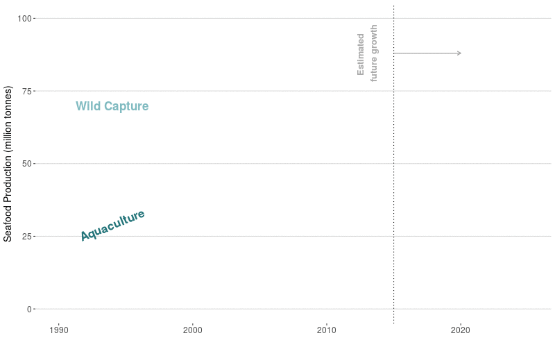
I spent a lot of time messing with the text sizes, colors, label placement, etc. I also learned how to add an arrow (thanks, geom_segment()). While I could keep tweaking this forever, I think it’s good enough as is. The whole process of learning how to use tweenr took me just a couple hours and I’m excited for the next opportunity to make something like this!